Framing and composition work together to determine what the viewer sees. Because they are two closely related concepts, many people often confuse them.

Framing is about the position and perspective of the viewer. It’s about their point of view. Because the camera is the viewer’s eyes, framing is about the position and perspective of the camera. 

In its simplest form, framing is about shot types and angles. For example, if the framing is “tight” and only includes the subject’s face, the viewer has a better opportunity to pick up emotional cues. One the other hand, if the camera is placed far away from the subject for a “wide” shot, the viewer can learn about the environment in which the subject exists. That environment provides context and meaning in the photo.

Candy Cigarette by Sally Mann


If the camera is angled downward on a subject the viewer sees them as small and weak. Whereas if the camera is angled upward, the subject seems powerful and maybe menacing.

Composition on the other hand refers to the arrangement of elements within the frame. For example, where is your character positioned within the frame or how are characters positioned relative to one another. We’ll delve into composition later. Let’s start by looking at framing. 

Framing: Shot Types

Before talking about shot types, I want to emphasize the idea that the camera is the eyes of the audience. The viewpoint and movement of the camera will tend to make the viewer respond emotionally as though they would having the same perspective in real life. So for example, if a shot is long or wide with the subject in the distance, the viewer will feel more like an objective observer. They are removed physically and emotionally from the character. On the other hand, if you are very close to someone, their face takes up your field of view, which would be the equivalent of what we’ll call a closeup. You don’t get this close to someone unless you are intimate with them. So a closeup will give the audience a feeling of knowing the character and sharing an intimate moment. Keep this idea in mind as we look at the various types of shots.

For filmmakers: Another thing to keep in mind that film is about movement. In the early days of cinema, it was difficult to move the camera around fluidly, as a result most cinema involved simply fixing the camera on a tripod and having movement happen within the frame. So the terminology around shot types is an artifact of this time when shots tended to be more static. With today’s technology, camera movement is easy and inexpensive. Even movement that would be impossible with real actors on real sets, can be easily created via CGI. If you can imagine a camera move, you can create it. So shots are much more dynamic. We can have the camera swoop from the edges of the earth’s atmosphere into a closeup of a character’s face in seconds. While we classify shots in a somewhat static way for practical purposes, the camera can move through the entire spectrum of framing in a single shot. 

We’ll explore shot types in detail, but let’s take a 30,000 foot view first to orient ourselves. We can say for practical purposes that there are essentially three types of shots:

  1. Wide shot: Going wide gives the viewer a sense for the environment, not the character. In photography a wide shot provides context for the viewer. It can be used as a master shot, an establishing shot or simply to show the majesty of an environment.
  2. Closeup shot: In this type of shot the character’s face takes up the largest part of the frame, so it is ideal and communicating emotion and intimacy.
  3. Medium shot: If a closeup and wide shot had a baby, it would be the medium shot. It typically includes the characters upper body. It’s close enough that we can observe their body language and the emotion of their face. At the same time we have context can see the environment or context in which the character lives. Because the shot provides such a wide range of information, it is the most commonly used shot in movies.

All other shots (ex. extreme wide, medium full, medium closeup) are all variations that fall along the range, from extreme wide to extreme closeup.

The lens choice is important in capturing each of these shot types. We’ll delve much more deeply into lenses later, but generally speaking, you’ll use a wide angle lens (a short lens <28mm) for wide shots, a medium lens (35-70mm) for medium shots, and a long lens for closeups (>90mm).

A visual summary of the various types of shots we’ll be discussing can be seen below. 

 
Shot Types Info Graphic (1)


Extreme Wide Shot

As the name suggests, this shot is extremely wide, and shows us an environment from a distance. It is usually used to show 1) the smallness or insignificance of the subject or 2) the majesty or grandeur of the setting. If there is a person in the frame, they are insignificant. We can see where they are situated, but there are really too small to be identified.

In film, this shot can be used as an “establishing shot”, which is a shot that sets the scene and orients the viewer to where the coming action will take place. In this scene from Lord of the Rings: Return of the King, for example, we see an extreme wide shot of Gandalf riding toward Minas Tirith, the heavily-fortified capital of Gondor. This tells the audience that anything they see immediately following is likely occurring within this city.

Wide shot (Full Shot or Long Shot)

The subject is completely shown in the frame from head to toe. It establishes the character in their immediate environment, highlighting their relationship to their surroundings and to other people. It takes the focus away from the individual to show the individual in a context.

When you watch a play or opera at a theatre, the proscenium that surrounds the stage essentially frames the actors in a wide shot of sorts. For most people, it’s harder to suspend belief and lose yourself in a theatrical production compared to a film. Part of the reason is that the characters are too far away to connect with. Likewise, the wide shot in film distances the character from the viewer, not just physically, but psychologically.

Because we can’t see the character’s faces well enough to read emotion, the wide shot is not as well suited for emotional scenes as medium shots or closeups. And because the actor can’t rely on their face alone to express emotion with a wide shot, they must use their body.

This shot allows for movement within the frame, so blocking can be used to communicate the story or show subtext. Like other wide shots, the characters are small enough within the frame to depict a sense of loneliness or isolation.

Medium Full or Medium Long

This shot goes by lots of names. The framing for this shot is from the thighs up, so it is often called a three-quarters shot because it shows three quarters of the character’s body. It’s also called the Cowboy or American shot because it was used extensively in Westerns to show the gun in a hip holster.

There is lots of room in the frame, so often the focus is on the location rather than the character. You’ll frequently see this framing used for an establishing shot because it shows a character in relation to their surroundings.

Medium

The medium shot frames characters from the waist up. It’s probably the most common type of shot in the movies. You’ll often see medium shots used in sequences where two people are talking or in dialogues that feature a small group of people. Medium shots are also used when the subject in the shot is delivering information, like newscasters. It is the preferred framing for interviews.

Think of your real-life conversations with friends or family. For example, imagine yourself sitting down for dinner with a friend. Their lower body is obscured so that all you see is the upper half of their body.

Meet the Fockers (2004)

If you are sitting elsewhere, you typically sit relatively close so that your focus is on their upper body.

Even when you’re standing, you’re usually close enough that you can’t take in their entire body. You take in the movement of their arms and the expressiveness of their faces, but you seldom look at their lower body.

This is why the medium shot is used almost exclusively for interviews. It is a relatable angle that everyone is used to seeing everyday.

Note how much information you get from the character’s body. Unlike a close-up of just their face, you can see how their body language contributes so much more to the scene, like the tired, collapsed posture of the sheriff in No Country for Old Men. His body conveys a sense of complete despair and defeat making this much more powerful than a closeup.

Medium shots are halfway between long shots and close-ups. As the middle child, it provides elements of both shots, showing both the intimacy of the closeup together with the environment of the long shot. So while a medium shot directs the viewer’s attention to a character, it also reveals a great deal about the context that the character finds themselves in.

In doing so it ties the character’s emotion or inner space with the physical space around them. We see both the world in which they exist and their emotional state within that space, so it tells us how the character feels and behaves within that context. So in using this shot, you cannot ignore the surroundings or the background. It is a vital element of this shot.

In this medium shot from The Shawshank Redemption, the director reveals the escape route from the prison. You see the shock of the warden and the reactions of the other guards. In the far background, you see the other posters on the cell wall, which helped draw attention away from the Rita Hayworth poster that was hiding this escape route.

Medium Closeup (Head & Shoulders Shot)

This shot frames the character from the mid-chest up. For this reason, it’s sometimes referred to as the “nip up” shot.

The focus, like all closeups, is squarely on the subject. This shot shows the face clearly, without getting uncomfortably close. You will see some of the background, but it’s really secondary to the character’s face and it’s often blurred so as not to distract the viewer.

While a medium shot is typically used for interviews and news programs, it’s certainly not unusual to see a medium closeup as well.

Closeup

A closeup usually shows the character from the neck up. Of course, you can do a closeup of any object, but for the purposes of talking about shot types, we’ll refer to closeups of people. We’ll talk more about closeup framing of objects when we discuss cut-ins. In closeup shots, the subject’s face takes up most of the frame.

They are used when emphasizing someone’s emotion. Whereas a medium shot communicates emotion through the character’s body language, the closeup communicates emotion through facial expression. We see their feeling communicated clearly through the eyes and the mouth.

From an evolutionary perspective, we have developed an oddly effective approach to tracking and reading faces. Facial expression is so important to our communication and social behavior that focusing on other people’s faces for cues is reflexive. It’s built into our DNA. We cannot stop tracking faces. The tracking happens almost instantly as they move or change, even subtly, as we look for clues as to what the people around us are thinking or feeling so we know how to respond or behave appropriately.

Take a look at this eye tracking study by marketing firm Stick.ai. The red areas show where the viewer’s eyes are focused when watching this short clip. Notice how viewers focus on the faces to the exclusion of almost everything else.

So the closeup allows us to do what we do best: Analyze faces closely for emotion and meaning. Filling the frame with your character’s face, especially during emotional scenes allows the audience to really get into the character’s mind and allows them to fully feel what the character is experiencing.

You don’t normally have the opportunity to see someone’s face this close unless you are intimate with them and physically close, so this shot provides the viewer with a strong sense of intimacy with the character. There’s a bond that forms between the character and the audience.

It’s a very powerful shot and should likely be saved for highly emotional moments in the story.

Although the closeup typically includes the neck, you can frame the shot even tighter to focus even more on the eyes and mouth. The face fills more of the frame, so that any background distraction is completely eliminated and we can put all our attention on the character.

Here is a standard closeup that includes the neck. Notice that the eyes are positioned about halfway down the frame.

If you want to frame tighter onto her face you’ll need to crop the top of her head and her chin. With this kind of framing, be sure to keep the eyes at the top third of the frame. Even though we are missing elements of the face, the eyes and mouth are clearly visible and that’s all we really need to see. It’s as if we are physically very close and that’s all that we see in our field of vision.

Compare that picture above to the picture below where the eyes are aligned closer to the bottom third of the frame. There’s something about it that just doesn’t seem right. The forehead is the prominent facial feature and we just don’t naturally focus on the forehead to interpret emotion. So this framing just feels weird.

Extreme closeup

Captures extreme detail. Our mind has no schema for this shot. It’s just not a way that we ever look at the world unless we are a clinician examining a patient.

The shot is not used to convey emotion because the face is too fractured to identify emotions accurately. We need a bigger picture to get a sense for what someone is feeling. If a medium or a closeup is a sentence that tells us what the character is feeling, an extreme closeup is like a word in the sentence. It’s separated from its context, so the extreme closeup functions more as a metaphor or symbol in the imagery. A tear is sadness; an eye is watching; a screaming mouth is terror.

The Divide (2011)

Dawn of the Planet of the Apes (2014)

Psycho (1960)

Because the extreme closeup is a highly stylized shot it should be used sparingly.

Framing: Angles and Point of View

Before we move forward, let’s do a quick recap. Framing is about the position and perspective of the viewer. And because the camera is the viewer’s eyes, framing is about the position and perspective of the camera.

So far, we’ve been looking at shot types. We gone from very wide to very close. These shot types define the audience’s relationship to the characters by moving them towards the subject for increased intimacy or away from our subjects for a more detached observational stance.

Now let’s look at shot angles. Whereas the shot types took us closer or further (Z-axis), angles take us higher or lower (Y-axis).

Eye Level

When you are at eye level with someone, you are at their level. It’s a typical perspective when having a conversation with a friend or acquaintance. It’s a neutral perspective. Shooting at eye level conveys a certain degree of equality in terms of power dynamic. You are not towering over your subject, nor are you looking up to them. This viewpoint doesn’t feel either threatening or submissive. It feels safe and comfortable, maybe serene. For this reason, eye level shots are almost always used for professional headshots.

This angle also allows you to easily look straight into someone’s eyes. Eyes are the window to the soul, so this perspective allows you to connect with the subject in a very direct and visceral way. It’s an intimate viewpoint. You feel like you know the subject.

Unless you’re freakishly tall or short, being at eye level with other people is the way we typically navigate through the world. Because it’s such a typical perspective, shooting at eye level can often feel commonplace or uninteresting. It’s what I might call a “walk up shot”. It’s the way most people photograph their friends and family. They just walk up to them, hold the camera in front of their face and take a snapshot. Eye level shots feel safe, but very pedestrian.

High angle

This really doesn’t need much explanation. A high angle is one that is typically higher than the subject’s eyes.

When the camera looks down at the subject from an elevated perspective, the shot is referred to as a high angle shot. It can convey important information related to the narrative, provide details about a character, and generate a response from the viewer.

If we consider the angle of the camera to be the viewpoint of the viewer, then in what situations do we find ourselves looking down on people?

We look down on children. Children are small and vulnerable and this is the overarching feeling that occurs with a high angle shot. The angle conveys a sense of vulnerability and innocence. We get the same feeling when looking down at pets.

The other common situation where we look at the world from this perspective is when we are standing and someone is laying down – on the floor, on a bed, on a couch. Perhaps walking into a bedroom when someone is sleeping or visiting someone in the hospital. Again there is a sense of vulnerability. The person is not upright and can’t take action easily. There is a feeling of powerlessness or weakness.

[insert a picture of someone praying to convey the feeling of a greater power looking over you or feeling small in the presence of something greater]

A high angle can achieve more than making our subject feel vulnerable.

What is closer to the camera looks larger. So when we move our camera upward, the focus on the face moves from the jaw and mouth and moves more strongly to the eyes. The eyes become the most prominent feature and can communicate more nuanced emotion or a stronger connection to the subject.

Because we don’t normally look at people from above, a extremely high angle can also feel a little disorienting or surreal.

High angles can sometimes be used to provide more context. For example, if this picture was taken at eye level we may may get a sense of concentration or frustration on the subject’s face. But by moving to a high angle we get the feeling of this woman being completed surrounded or immersed in her work. Her work is consuming her, eating her up.

High angles can also allow us to capture our subject in positions that we just couldn’t capture with our camera more oriented with the horizon.

Low Angle

A low angle shot is any shot taken below eye level. 

When you look up at someone they are usually bigger than you are. And bigger means stronger. So shooting someone from a low angle gives your subject a feeling of power and dominance. So we often call low angle shots superman or hero shots. 

Take a look at these Wonder Woman images. Obviously taken in different eras, but rather than the style of the image, look at the angle. Gal Godot looks much more powerful than Lynda Carter as Wonder Woman.  The angle doesn’t have to be an extreme low angle to get this effect, but typically, the lower the camera, the more dramatic the effect. Using a wide-angle lens accentuates this ‘superman’ effect.

This is a good angle to use with short models or subjects because the perspective elongates the legs and makes your subject look tall. 

Solenne is not particularly tall, maybe 5’2″ (<160cm), but the low angle combined with the high cut bodysuit makes her look very statuesque. 

By shooting low you can use leading lines to direct your viewers attention. Leading lines refer to a technique or rule of composition where you use lines that direct the viewers’ attention to the main subject of the image. We’ll talk more about leading lines when we look at composition. 

Compare these two images. One is eye level shot and the other takes the camera lower so that the line of the stairs and the railing naturally lead your viewer’s eyes to this person’s face. 

You don’t necessarily need stairs, you can use the walls of buildings, doorways, storefronts, etc. 

Although you don’t have to use a low angle to make use of leading lines, it’s an easy and obvious way to incorporate this compositional technique into your photos.

If we look at this picture of three women sitting on stairs, we see that the stairs provide leading lines, but these lines lead us away from the subjects up the stairs to the bright light at the top. It pulls our attention away from their faces, which is really what we should be focusing on. If the photographer would have moved towards the top of the stairs, those lines would have worked more effectively. And their heads could be framed against the bright area at the top of the stairs, providing more contrast and more depth, making them pop out of the picture more. 

And this brings us to another benefit of low angles: A low angle makes it easier to frame your subject. If we look at this picture we have the outer edges of the picture which creates the frame, but we have a bright area of light around the subject’s head which provides a frame within the frame. This kind of contrast is useful in directing the viewer’s eyes towards the point of interest (her face) and provides greater dimension to the image. Dropping your angle can allow you to frame your subject’s face above the horizon level and against the sky (or other contrasting elements), so that their face does not get lost in other background details. 

Compare these two photos. The subjects and general framing are very similar. In the first picture, the photographer is standing and the subjects’ heads are right on the horizon line. In the second, the photographer has dropped their angle to frame the couples’ heads against the sky. The point of interest, the couple, is no longer competing with the messy background behind their heads and the picture looks cleaner, more interesting and carries more drama. 

One of the most common bits of advice I hear about portraits is to never shoot low because it’s unflattering to the face. This may be true if you are taking selfies with a phone, which has a wide lens that causes a fair amount of distortion. But for the most part this is a lie. Your subject can look good from both a high or low angle if you do it right. One word of caution, however: If you are shoot a low angle, be sure to get some distance from your subject. If you are too close, your subject’s jaw will look unnaturally large and we’ll end up looking up their nose.  

Ocean-View-Club-Wedding-Harbour-Island-Bahamas_0063saltonsea-engagement-24
three-women-smiling-while-sitting-on-stairs (1)candice-picard-aKvzxX8lQdg-unsplash (1)

Credits: Image 1: Photo by Machol Butler on Pixeor.com; Image 2: Photo by Candice Picard on UnsplashPhoto by Khalid Garcia from Pexels

You don’t have to shoot low to get this effect. In this image below by Josef Koudelka, the shot is a high shoot, but he has contrasted the dog with the snow and the leading lines are low to keep your focus on the center of the frame. 

wonder woman lynda carterwonder woman gal godot
Josef Koudelka
409052020 Dsc05629 2 2

Paulo Nunes is a talented boudoir photographer that frequently tilts his images to provide an added sense of energy and excitement.

Dutch Angle

We have an instinctive need to align our eyes with the horizon. We never talk to people with our heads tilted off to the side. So as a general rule, we always keep the camera, which are the eyes of the viewer, on a horizontal plane. Of course all rules can be broken and you’ll see this rule broken when you want to make the viewer uncomfortable or to indicate that something is not right in your character’s world. One of the most obvious examples of this is the “Dutch angle” or the “Dutch tilt”.

A Dutch angle is a film term that refers to the filmmaker purposely tilting the camera. You’ll see this used in movies where the main character starts to lose touch with reality, where their sense of what’s real or true begins to fall apart, or where their world is being turned upside down.

What makes it Dutch? Dutch is actually just a mispronunciation of Deutch, which is the German word for German. It originated with German filmmakers during World War I. Unlike Hollywood, which typically produced stories with happy endings, the German film industry was part of an Expressionist movement in art and literature, which was grappling with the insanity of world war. One of their techniques was the Dutch angle, which eschewed the harmonious horizontal and vertical lines of traditional film in favor of diagonal lines and the various responses (ex. anxiety, tension, confusion) evoked by the image’s dynamism.

The Dutch angle does not always have to convey a sense of confusion or disorientation. For whatever reason, diagonal lines in an photo provide a strong dynamic element in images. When doing portraits of an upright figure, the lines tend to be vertical. By tilting the camera, you change the balance and provide a a sense of movement. It’s as though the image is going to slide out of the frame. So tilting your image, either in camera or in post, can add energy to what would normally be a dull picture. 

POV

See https://www.youtube.com/watch?v=ScRPUZuFhd8

Manic (2012) is also shot with a great deal of POV: https://www.youtube.com/watch?v=CiULAdLufJs
Compilations: https://vimeo.com/112167948 and https://vimeo.com/110959542

POV is an acronym for “Point of View,” because it shows what a character or group of characters is seeing from their vantage point.

In photography

POV shots are typically peek a boo shots. That is, they are voyeuristic, peeking through windows, doors or objects to see the subject without their knowing. 

You can get a POV shot from inanimate objects as well. For example, we get shots from within the fridge or the dryer, from the bottom of a toilet or pool, or if you are watching a Tarantino movie from the inside of a trunk.

Img 9738 (1)

A great set of voyeuristic images by Bingham X

You see these kind of “follow me” POV images so much on social media that they have pretty much become cliché.  Murad Osmann became a bit of an Internet sensation because of his series of his POV images with his girlfriend leading him around the world. Of course, the classic photo of your feet has become cliché as well.  

59106377 297292711202714 3633217627536311198 N
105989869 1167100170341018 578701756902338246 N
130584687 2485679915070024 5018944962310753101 N
89102196 135520107951649 2145056166543938567 N
Pexels Samuel Silitonga 789549 (1)
Photo by Samuel Silitonga from Pexels
Pexels Matt Hardy 2755147 (1)
Photo by Matt Hardy from Pexels

POV in Films

Most of the time, we watch films as a voyer, an objective outside who watches the events unfold from the safety of our comfortable seat. But with a POV shot, we are pushed out of our seats and experience events from the perspective of a character within the film. Suddenly, we aren’t watching that character from afar but seeing through their eyes, temporarily becoming them.

The psychological impact of becoming a character is powerful tool for making the audience connect with the happenings in the scene in a very visceral way. For this reason, they are frequently used in horror movies. The Blair Witch Project is just one example that most people are familiar with where the audience is seeing events unfold through the camera the main character is using.

The Lady in the Lake was the first film to be shot almost entirely from the point of view of the main character in 1947. It was an experiment of sorts that wasn’t repeated until 2015, when Hardcore Henry, an action film shot entirely through the main character’s POV, was released. These are interesting concept films, but the shot is too limiting to be used that extensively.

Hardcore Harry trailer: https://www.youtube.com/watch?v=UI1Ovh5JnOE
Lady in the Lake trailer: https://www.youtube.com/watch?v=mB-PyUSFskI

But for occasional use, the shot can be incredibly effective at creating empathy for the character.

Hitchcock is noted for making extensive use of the POV shot. For example, in the movie Rear Window (1954) a murder mystery unfolds through the eyes of a wheelchair-bound photographer who spies on his neighbors from his apartment window.

There is usually a setup: There is a shot of the character looking toward something, then the POV shot is introduced, and then we watch the character’s reaction to what they’ve seen. Take a look at the use the POV shot by Alfred Hitchcock in this crop duster scene from North By Northwest and see this pattern repeat over and over. https://www.youtube.com/watch?v=sIY7BQkbIT8

There are some classic type of POV shots: Looking out of an eye, for example, when a character is coming out of sleep or a coma; looking through a keyhole or peep hole, or looking through binoculars, telescope, a gun scope, a camera; robot vision; and the reading POV, where we read a document from the characters eyes.

The point of view is not necessarily a human. We often see the POV of predators, like this classic shot of the point of view of the shark in the opening of scene from Jaws.


Composition

As I’ve mentioned previously, framing is about the position and perspective of the viewer. Composition, on the other hand, refers to the arrangement of elements within the frame. For example, where is your character positioned within the frame or how are characters positioned relative to one another. 

Good composition is not about creating a nice looking image. Composition serves the story by directing the viewer’s eyes to the elements or details that are vital for moving the story forward. 

You want the viewer’s focus to be on the story and not on the technique that’s used. To avoid distracting your audience and taking them out of the story, it’s good to stick with conventions unless there is a motivated reason not to. 

Here are some basic rules you should follow…

Maintain the horizontal

As humans, we have a basic reflex that makes our eyes line up with the horizon. When the horizon is not level, we feel a strong sense of disorientation. We sense that something isn’t right. We feel off kilter. Even a slight angle makes us feel uneasy, even if it is below our conscious awareness. So it is vitally important to keep the horizon level. Level your camera before taking the shot or if the camera person screwed up, level the horizon in your editor in post production.

Rule of thirds

The amateur filmmaker tends to frame their subjects right in the middle of the shot. This creates a stable feeling as the background is usually equally weighted on each side of the character. But the level of balance in this type of shot makes it seem a little dull. 

Because there is so little symmetry in nature, when we have a high level of symmetry in a shot, it can feel a little otherworldly, artificial or contrived. For example, director Wes Anderson uses symmetry extensively in his movies, enhancing the storybook feel. 

The Darjeeling Limited (2007)

On the other hand, if you frame your subject to one side of the frame, the shot immediately looks more dynamic. Rather than feeling unbalanced, the shot seems more aesthetically pleasing. This is because nature is by and large unsymmetrical. And this offset framing seems more natural to us. It’s what we are accustomed to. 

As a simple way of making your shot more dynamic, use the rule of thirds. Imagine two lines across your screen horizontally and two vertically so that your shot is divided into thirds both ways. The rule of thirds states that a subject should be positioned along the lines or more specifically at the intersection of the lines. 

Tomorrowland (2015)

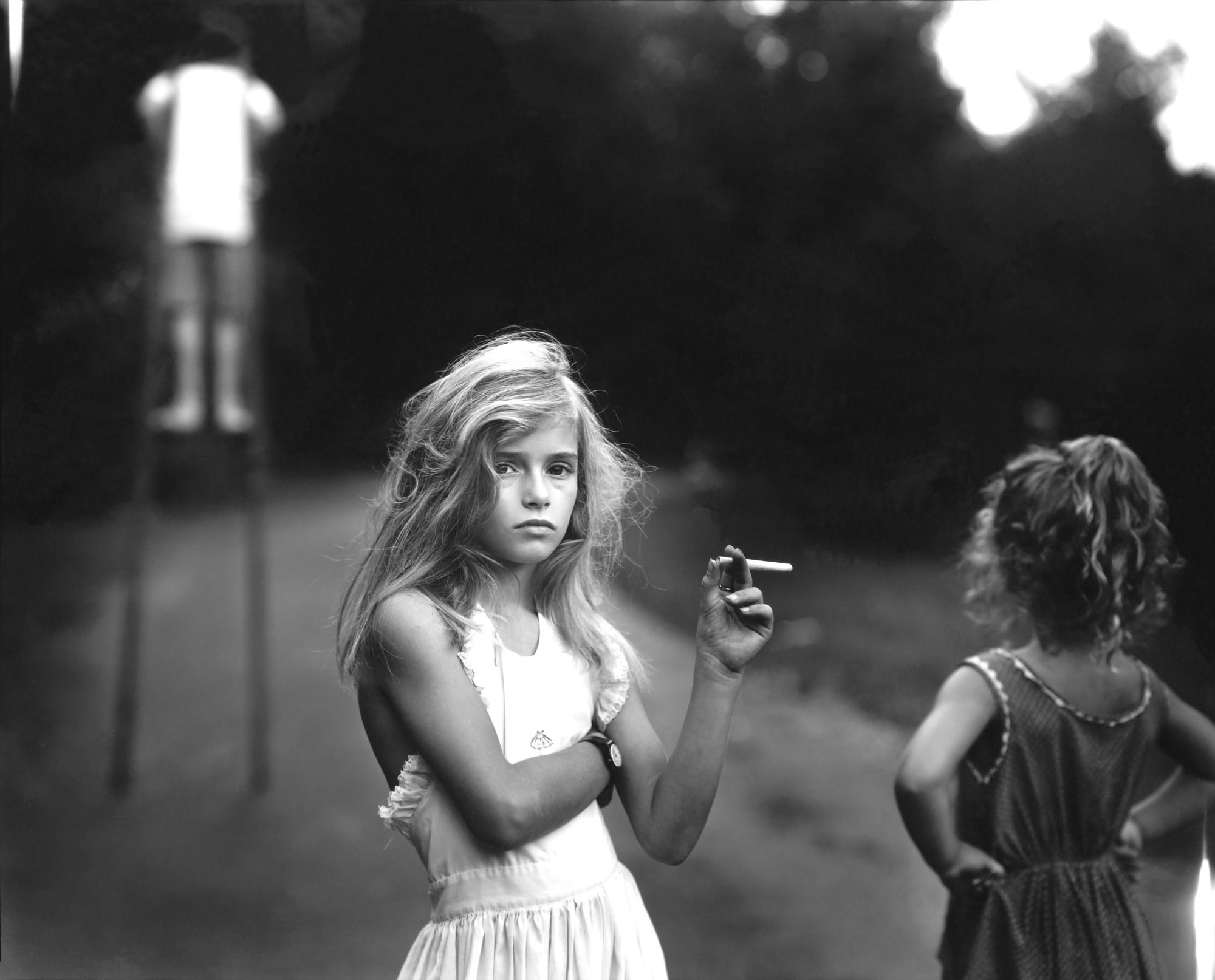
If you are shooting a person, put their face at the intersection of the lines. If you are doing a closeup, place their eyes (or the eye that is closest to the camera) on the intersection.  

Scandal (2016)

If you are shooting a horizon, place the horizon on the top line or the bottom line, but not in the middle of the frame. 

Mad Max Fury Road (2015)

Negative space: Headroom and Leading room

If you’ve taken an art class you may be familiar with the idea of positive space (typically your subject) and negative space (the space around your subject). It’s important to be aware of that space around your subject. If there is too little space, the viewer will get the sense that your character is confined or stuck. 

If your characters head is too close to the top of the frame, it feels like they are boxed in. Unless that is the feeling you want to convey, make sure there is space between the person’s head and the top edge of the frame. With closeup shots, we obviously have to crop the person’s face, so this doesn’t apply. But in this case, be sure to stick to the rule of thirds. 

Headroom relates to vertical space whereas leading room refers to horizontal space. Typically, you want to give your subject space to look into. So position either the camera or the subject so that they are facing the open side of the frame. If you put their face against the side of the frame, they appear to be trapped or restricted. 

Spatial Depth

A good video here: https://www.youtube.com/watch?v=obcapI-8cu8 

This is something I don’t see written or talked about frequently, but creating spatial depth really sets your composition apart. 

In the real world we see everything in full 3D. Photos and film, by contrast, appear on a flat, two dimensional surface. To get a sense of being in the real world of depth or dimension, you have to pay special attention to the placement of objects in the foreground, middleground and background to give the illusion of spatial depth. It’s one of those things that sets a superbly crafted composition apart from that of amateurs. 

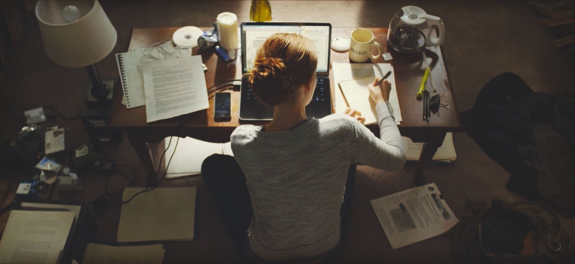
The TV series Scandal makes a great use spatial layers to add depth and richness to almost every shot. In this shot for example, we have the main character out of focus in the foreground. A lamp and desk and another character create a middleground layer. Then we have a third character and various objects creating multiple background layers. 

Take a look at this sequence and notice the layers and depth that are created through composition. Even the character sitting at the computer screen has a semi-transparent image of what’s on the screen floating in the foreground. 

Whenever you see a film that looks visually superb, take a moment to tune into the layers that are present in the frames. 

Here are some simple tips for adding more spatial depth to a shot. 

Use wider lenses. If it’s appropriate to do so, shoot wide with a short lens. Shooting with a long lens tends to compress the image. A short lens will make objects in the foreground and background appear more distant and increases the perception of depth. 

Move people away from walls. There is nothing more dull than a person or people standing against a wall. It completely eliminates any possibility for depth in the shot. Separate your actors from the walls as much as possible. Even if you can’t get any foreground or middleground elements in the shot, it will still provide more depth than standing directly against the wall. If you can dress the wall with a side table, lamp, pictures, etc., so much the better. 

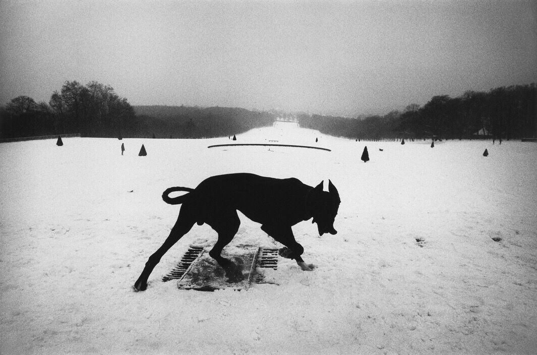
Find a way to block your view. Look for elements that you can get into the foreground. It will block the camera’s view, but that’s okay because it creates a frame for your subject. For example, if two people are arguing in a small room and you can’t create enough separation from the actors and the wall, step out of the room and shot the scene through the door frame for enhanced spatial depth. 

Road to Perdition

Find ways to frame your primary subject. For example, instead of a simple medium shot of your actor, shot them looking into a mirror for added depth. Instead of shooting the face of someone looking out a window, go outside and shoot through the frame of the window. 

Paris Texas (1984)

Check out this montage from The Ipcress File (1965) for inspiration. 

Full montage here: https://vimeo.com/85318407 (The Ipcress File, 1965)

Other ways that you can create spatial depth is through contrast (which we’ll talk about next), depth of field, perspective lines, and parallax (all of which are discussed at other points in the course). 

Contrast

Composition is not just used to create a pleasing image. Part of the role of composition is to draw attention to what you want the viewer to see. One powerful way to do this is through contrast. There are a number of elements that we can use for contrast: Light, color, size, and movement. 

Light

When a subject is lighter or darker than it’s background it stands out. So light the subject or areas you want to draw attention to so that they contrast with a darker background. The opposite is also true: Think silhouettes. 

Dunkirk (2017)

Be careful that you don’t create distractions in the frame by accidentally highlighting something that isn’t important.

In the era of black and white films, directors relied heavily on contrasting light and dark and you can study these films to see how the experts did it. 

DOA (1950)

Color

Now in the era of color films we have an additional tool to create contrast and direct the viewer’s eye. A big trend right now is to use teal and orange in the color palette of films. If you look for it, you’ll see it everywhere. 

Why teal and orange? Because orange complements skin tones well and teal is the opposite color on the color wheel, so you get great contrast in using these colors. Using any colors that sit opposite on the color wheel would work to create visual contrast. 

Size

It just makes sense that we look at things that are larger. They take up more visual space. And in taking up space they becomes important or dominant. 

There is a language in film and when we show something closeup so that it takes up a lot of the frame, we are saying, “Looking carefully. This is important.” Or in the word’s of Anton Chekhov, “If you say in the first chapter that there is a rifle hanging on the wall, in the second or third chapter it absolutely must go off. If it’s not going to be fired, it shouldn’t be hanging there.”

Lord of the Rings

Christopher Nolan uses this technique in The Game (1997) in an unusual way. He uses closeups as a red herring. Knowing that the audience is going to assign meaning and importance to things that are closeup, he diverts their attention by focusing on objects that are not relevant and keeps the audience from guessing what’s actually happening. 

In terms of characters, make the character of focus larger than others in the frame. It’s film convention to make the more important, powerful or dominant character larger within the frame, but sometimes you are better served by making minor characters the focus if their actions or reactions are of importance to the story. 

Movement

Another way you can draw attention to important elements or characters in the frame is through movement. Keep in mind that we are discussing directing the viewer’s eye through contrast, so the object or person needs to show movement relative to the rest of the scene. 

Sidenote: We’ve been looking at using contrasting elements within the frame to direct the viewer’s attention. When something is different, we notice it. This principle can apply to not just a frame, but a sequence of cuts. For example, you can hold on a wide shot for a period of time and then cut into a closeup for the moment you want to have the most impact. The contrast jolts the audience and makes them pay attention. In this scene from Dr. Strangelove (1964), the director holds the wide shot for about three minutes before cutting to the closeup. Even without sound you know that this is an important moment. We’ll talk more about using contrast in this way when we talk about editing. 

Dr. Strangelove (1964)

Don’t cut at the joints

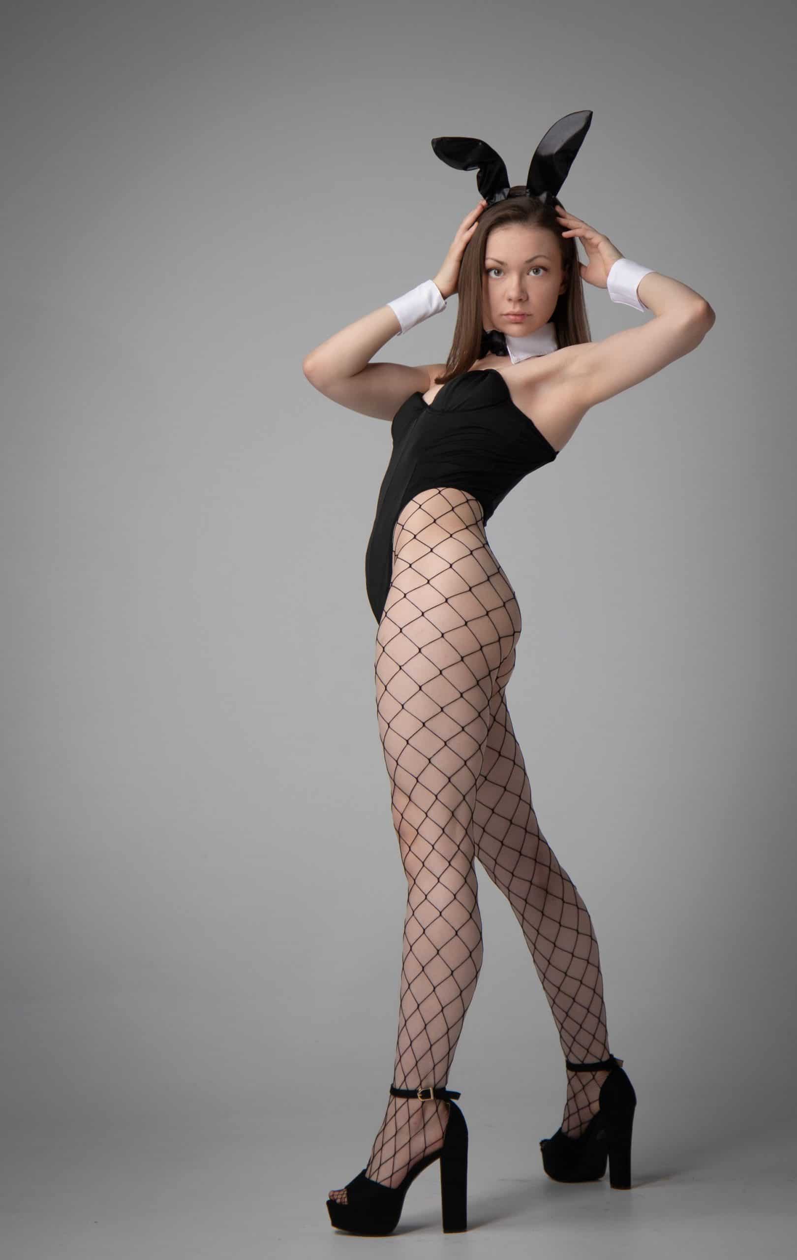
Framing at the level of the joints leaves the viewer with an odd feeling that the limb is amputated. When framing a medium shot try to avoid cutting directly at the elbows. Iif your character is static, frame just above or below the elbow joint. 

The same applies to the knees. Never cut directly at the level of the knees, but rather just above or below. It’s a subtle thing, but check out the framing of these shots and you’ll see what a big difference it makes. Look at this picture. Because she is cut at the knees it looks a little like an amputation. There’s nothing that indicates her legs continue below the frame. 

Compare that to either of these next shots which are more visually pleasing. This one is cut above the knee. You can see part of her thigh and can imagine it continuing below the frame. You’ll recognize this framing as the medium full or cowboy shot that we’ve looked at already. The same applies to the shot which is cut below the knee. We can imagine her lower leg continuing below the frame. 

Balance and symmetry

Balance in composition is a little more complex than many of the other elements. Balance is not synonymous with symmetry. If you think of the frame being divided in half either horizontally or vertically, balance requires that bright or dark areas, colors, objects or characters are weighted equally on each side of those lines. The weight of an element is not determined by its size, but rather by its level of visual interest. 

This is a difficult concept to understand, so let’s look at an example. In the pictures below there are two primary elements: A sign and and building. You can see right away that the image on the left looks balanced while the others look unbalanced. This occurs despite the difference in size between the elements and the lack of symmetry. It appears to be balanced because the element on each side of the centerline has equal visual weight. The building, even though it’s somewhat smaller, is brighter and closer to the center, so it has more visual prominence. 

Photo by Shannon Kokoska

It’s not that one of these pictures is good and the others are bad. The balanced frame just leaves us with a different feeling than the unbalanced frames. Balance within a frame tends to convey a orderly, formal, disciplined, calm, or peaceful feeling. The unbalanced frames leave you with a sense of unease, sloppiness, disorder, chaos, tension or discomfort.   

Balance does not mean symmetry. Symmetry occurs when the elements on each side of the frame are similar. 

Full Metal Jacket

In talking about balance, it may be useful to talk about formal and informal balance. 

Formal Balance

Formal balance employs symmetry. It’s about having the elements on each side of the frame be similar. 

Equilibrium (2002)

Symmetry makes use of one-point perspective. All perspective lines converge into the center of the frame and this makes the central figure a powerful focus in the frame. 

The Shining

Formal balance creates a feeling of formality and discipline, so you’ll often see symmetry in formal events, like weddings, graduations or military displays. 

The Twilight Saga: Breaking Dawn – Part 1

Two directors who use formal balance as a major part of their aesthetic are Stanley Kubrick and Wes Anderson. 

Video by kogonada. Full video: https://vimeo.com/89302848 

Video by kogonada. Full video: https://vimeo.com/48425421

Because symmetry is not common in our everyday lives, when symmetry is used extensively it creates an otherworldly feel. If we take a look at Stanley Kubrick films (The Shining, Full Metal Jacket, 2001 A Space Odyssey, Clockwork Orange), it often conveys a sense of the sinister. On the other hand, in Wes Anderson films (Moonrise Kingdom, The Grand Budapest Hotel, The Royal Tenenbaums. Fantastic Mr Fox) it conveys a sense of the unreal, theatricality, story, fantasy. 

Symmetry is a visually powerful composition, but it is also obvious and has a feeling of artificiality. So most filmmakers use it sparingly to avoid pulling viewers out of the story. Conventionally, symmetry saved for key moments in a film and is used to show that a particular character has power or that they’ve come to some important realization. 

Informal Balance

Unlike symmetry, informal balance occurs when dissimilar elements balance each other out on each side of the frame. Informal balance is a less obvious form of balance and it’s a concept that’s difficult to describe simply because it can be achieved in so many ways. 

When an image is balanced correctly, it seems very natural. It feels right. It looks stable and aesthetically pleasing.  It provides a sense of harmony, steadiness, and calm. While some of its elements might be focal points and attract your eye, no one area of the composition draws your eye so much that you can’t see the other areas.

Sony World Photography Award Winner

The size of each element is largely irrelevant, but more often than not it’s better to have a larger element juxtaposed with a smaller element or elements to make a good composition. What matters is:

  1. Visual weight
  2. Visual direction

Visual Weight

Balancing the left and right sides normally gives off a feeling of harmony. 

When the visual weight is uneven we feel a sense of things not being right. It creates a feeling of tension or anxiety. 

But as I’ve already pointed out, balance doesn’t have to be symmetrical. Objects on one side of the screen can be balanced with objects on the other side of the screen that aren’t their mirror image. In this case, simply moving the larger figure closer to the center restores balance. 

Let’s look at a variety of ways you can create informal or asymmetrical balance through visual weight…

Balance by Value: The eye is attracted to contrast so a small area of high contrast will balance a larger area of low contrast.


Balance by Color: The eye is more attracted to color than to a neutral image, so a small region of color, especially a bright color, can balance a larger neutral region. 


Balance by Shape: A small complicated shape can balance a large simple shape. Also, a large uncluttered area can balance a small busy area containing many shapes. 


Balance by texture: Texture and surface are similar to value, color, and shape, i.e. a busy, high contrast texture on a small shape will balance a larger shape with a smooth surface. 


Balance by position: A smaller object farther away from the center will balance a larger object that is closer to the center. 


Balance by movement: The eye is attracted to movement, so a small moving object will balance a large stationery one. 


There’s no way to precisely measure the visual weight of any particular element. Develop an eye and then trust it. Use your experience and judgment to determine which elements have greater or lesser weight. The areas of a composition that attract your eye are those that have greater visual weight. Learn to trust your eye.

Visual Direction

The second way to balance is through visual direction. If visual weight is about attracting the eye to a particular location, then visual direction is about leading the eye to the next location. Visual direction serves a similar function to visual weight in that it’s trying to get you to notice certain parts of the composition. Whereas visual weight is shouting “Look at me!,” visual direction is saying “Look over there!” 

The way this is typically accomplished is through leading lines and we’ll look at this as a topic of its own. 

This was a great article on balance with asymmetry and was the basis for my illustrations: https://www.siggraph.org/education/materials/HyperGraph/design/composition/balance_in_composition.htm

Here is a series of articles that I must read: 

https://www.smashingmagazine.com/2015/06/design-principles-compositional-balance-symmetry-asymmetry/

https://www.smashingmagazine.com/2014/12/design-principles-visual-weight-direction/

Leading Lines

Lines serve as a path for our eyes to follow and we scan along lines very naturally. Maybe it’s an evolutionary trait that has developed from millions of years of scanning the horizon or tree branches for predators or prey. Who knows? But we do it very instinctually. 

Knowing this, we can use lines to lead the viewer’s eyes to the principal subject in the frame. This composition technique is known simply as leading lines. 

When you pay attention, you’ll see the lines everywhere: A fence, a path, rays of sun, an outstretched arm, the edge of a building, the horizon, a flight of stairs, etc. 

Blade Runner

I love this image where the shadows form the leading lines, along with the secondary line of the wall. 

The New World

Cube (1997)

In this image, our focus first goes to the dominant character played by Harvey Keitel, but the line of his arm, along with the secondary lines from the set, lead our eye almost immediately to the secondary character on the floor.